Under prospecting methods, E-mail marketing is one of the most traditional ways of reaching out to prospects. Many huge business industries as well as newly emerged firms rely on email marketing as their primary source to increase engagement. But Statistica estimated that companies send and receive approximately 120 emails per day daily. They even reported that the number of emails sent will be approximately 333.2(billion) in 2022.
These numbers worry a lot of marketers since it’s a lot of competition to secure a good position in the world of digital marketing. When it comes to email marketing, there are a few things one should keep in mind while drafting one. Let’s take a look!
Tips To Make Your E-mail More Appealing.
There are two main traits your email MUST possess. The traits are visually appealing and engaging. Listed are a few things which will accomplish both attributes.
1. Create A Conspicuous Header
A header is very much required by every newsletter, be it a paperback version or a digital version. It should resemble or mix in with your newsletter title, company name, or logo. Nowadays, it’s particularly easy to prepare a header since there is a lot of digital software which will create one for you. Therefore, if you are a new company and considerably an amateur when it comes to graphic designing then the use of platforms such as Stencil and Pixlr is very much recommended. fancy
2. Use Of A Limited Color Scheme Palette
While preparing a newsletter, you should avoid going overboard with colors. Use neutral-toned and limited colors or perhaps use the colors which make up your company logo. Limit the use of colors between the range of 2-4 excluding your brand color. The reason why it is recommended to use your brand logo’s color palette is that it represents accountability and authority. Those colors give your brand stature, so don’t step back from using them to grab prospects’ attention.
3. Don’t Overboard With Fancy Fonts
Sure, cursive and fancy fonts look eye appealing but they are also hard to read many times. You must not comprise your quality information with quality appearance. The purpose of sending email is not to showcase your brand aesthetics but rather what it sells or specializes in. While writing an email, you can stick to the use of Times New Roman, Helvetica, or Arial.
Furthermore, refrain from using multiple fonts in one email. It makes it look cluttered and shabby which ultimately increases the chances of distracting the reader. You can use a maximum of two fonts to write your newsletter bearing in mind that the fonts execute texts clearly and boldly.
4. Divide The Content To Improve Readability
To optimize the readability, involve the use of subheadings. Subheadings help the reader skim through the newsletter or read a particular topic they are interested in. While applying the subheading, you should keep in mind the following:
- Use one single font for every subheading
- The font size should be bigger than the text beneath
- Font size should be smaller than the header
- It should summarize the content in a few words
- It should not be wordy
5. Include Media, But Sparingly
Including media such as images, GIFs, and Videos elevates the look of the email. A reader would be more engaged if there are visuals in a newsletter. While uploading media ensure that the file size isn’t large or else it slows down the page speed and always uses a backup color in case the media fails to pop up. GIFs and videos are larger when compared to images, so use them when you feel it is absolutely necessary or brings value to email.
Furthermore, your text-to-image ratio must be reasonable. Your newsletter should not be all images and less information. It is suggested that the ratio must be 60% text to 40% images or even better 70% text to 30% images.
6. Application Of Inverted Pyramid Model.

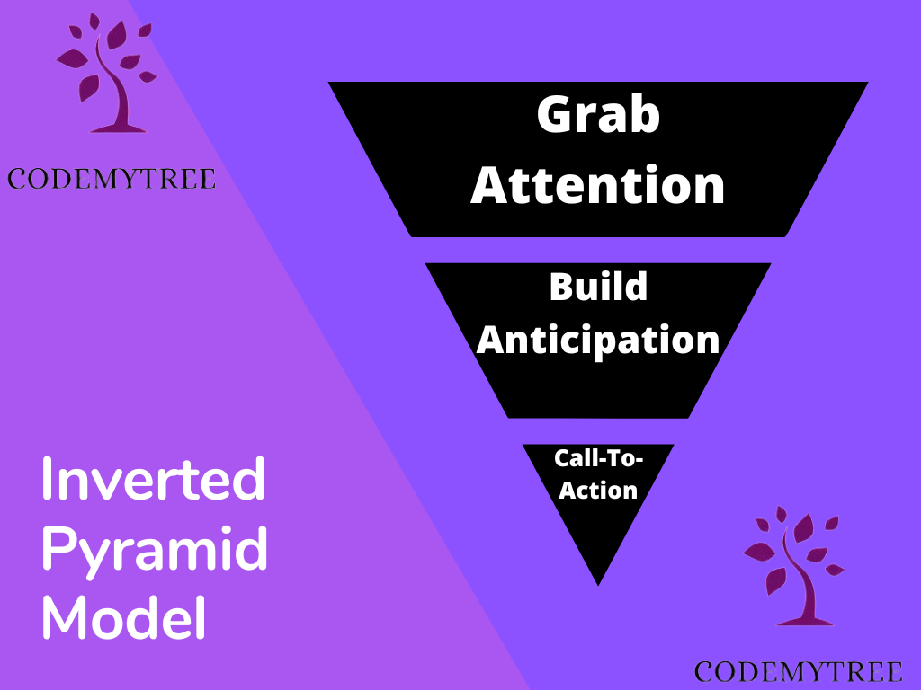
At the top of the layout, the photos and headers are centered. The text shrinks as it approaches the tip of the pyramid, ending with a call to action. When used for a single email, it works incredibly well. Nevertheless, if you apply it to each objective separately, you can use it securely for emails with multiple messages.
7. Ensure The Layout Design Is Mobile Friendly.
It is estimated that over 50% of emails are read on mobile devices. Consider that many of your recipients will be viewing your emails on their smartphones. To ensure that your email fits every screen, you should focus your efforts on designing it.
Conclusion
It doesn’t matter how big your approach is if it doesn’t have a well-thought-out email design. You must design your email correctly if you want your campaign to succeed. The contemporary trend demands appealing aesthetics and a positive user experience. Consequently, it requires your undivided attention. Your email marketing campaigns can be successful if you follow the 7 tips we’ve discussed.